ASUCD Matcha Shirt
ASUCD
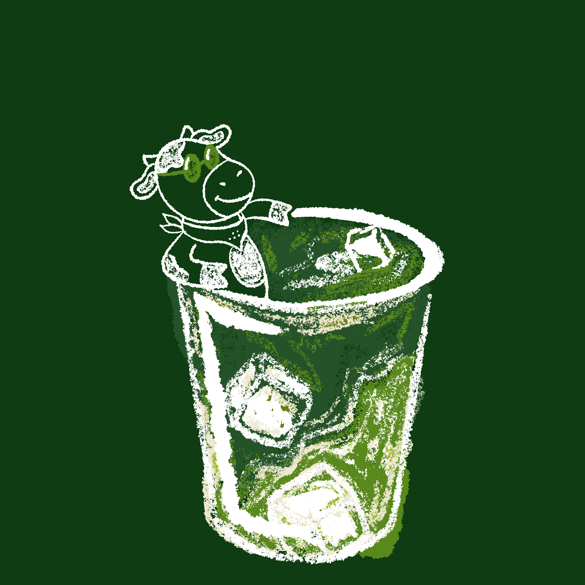
Matcha Shirt
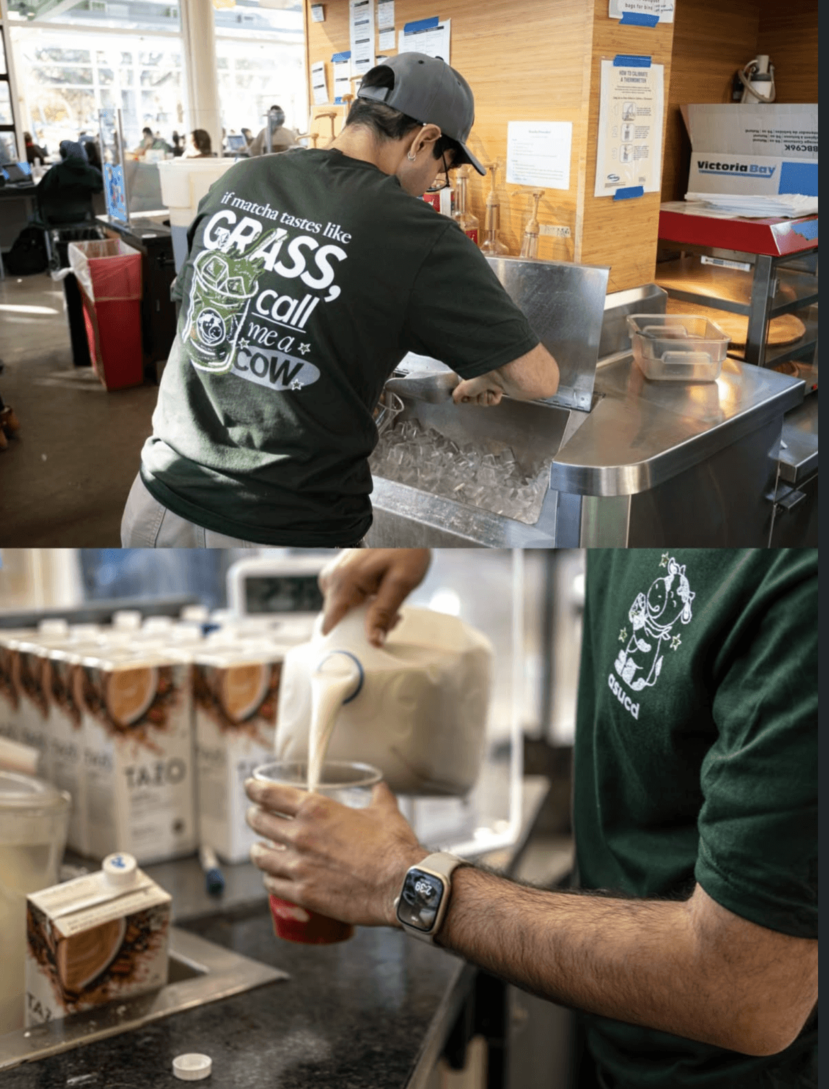
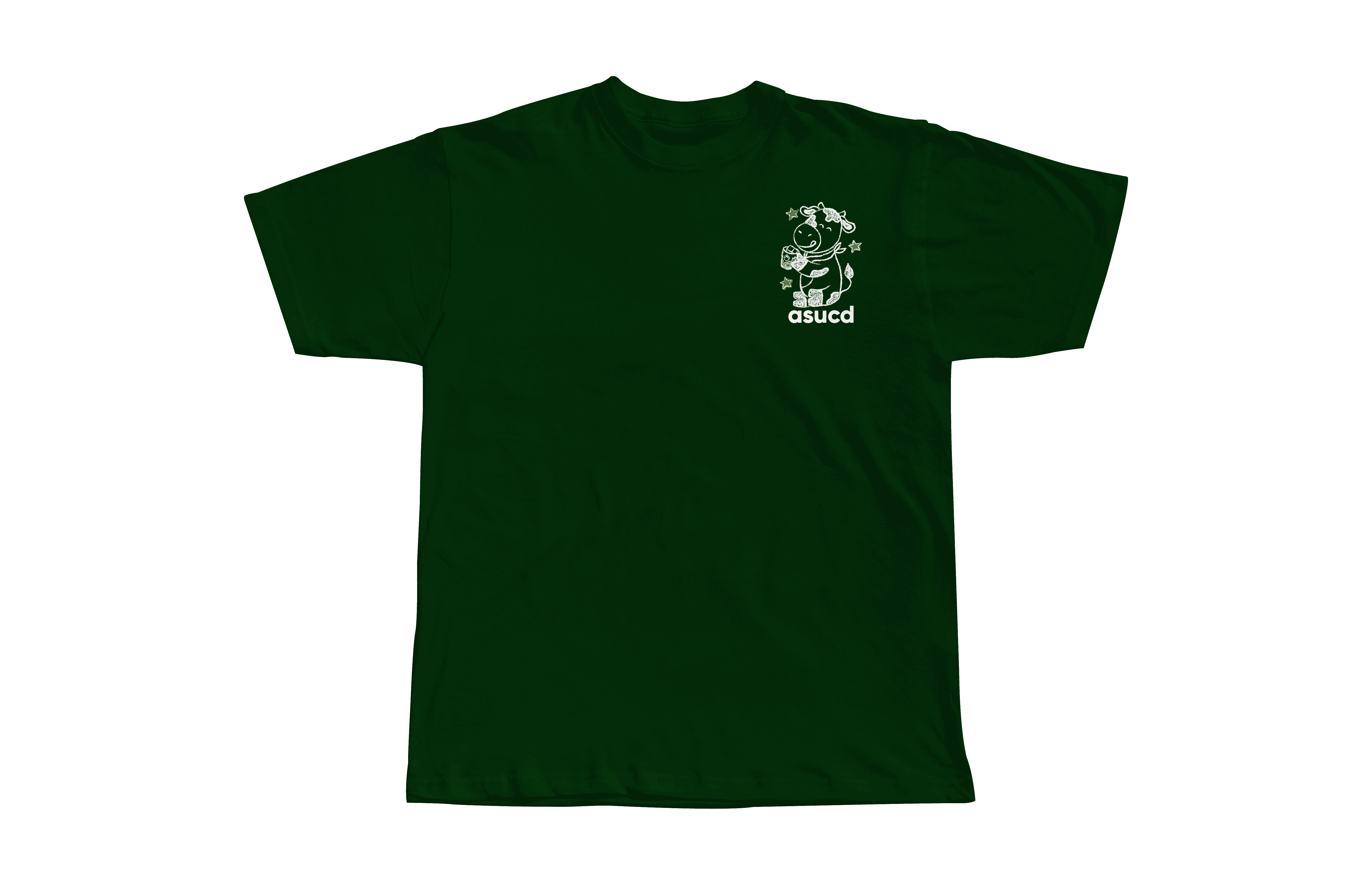
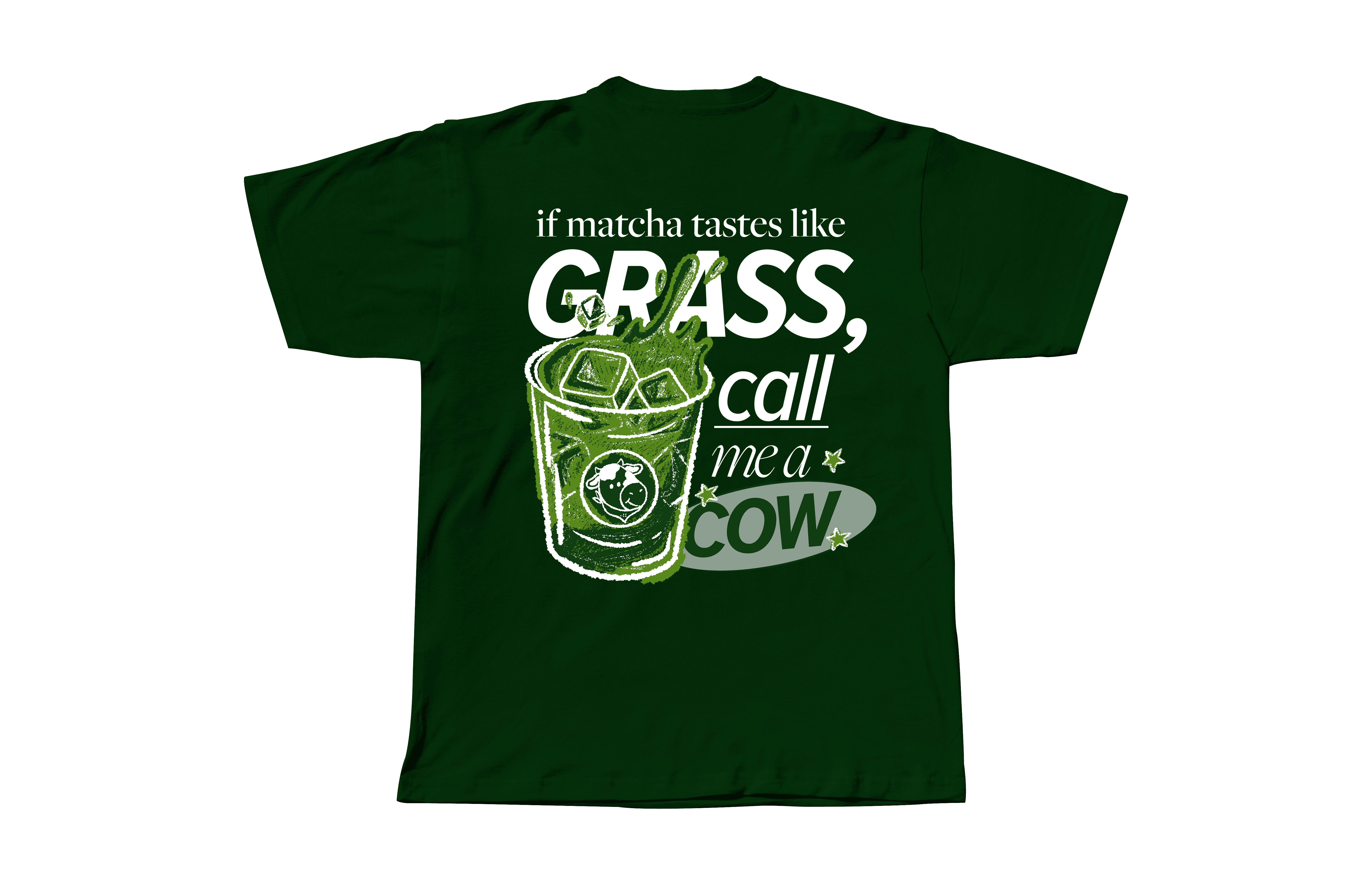
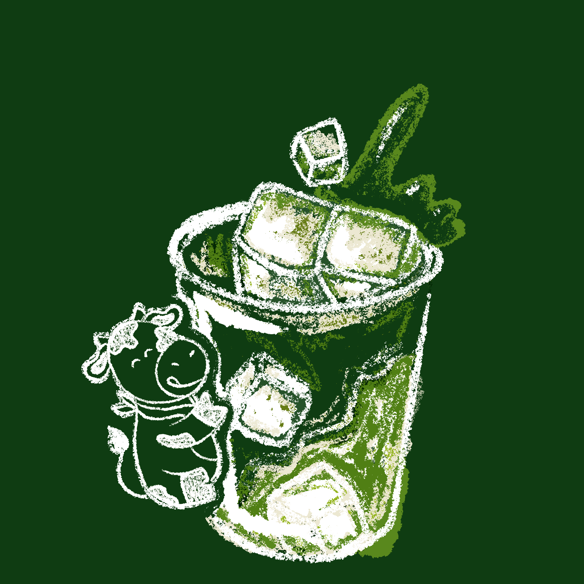
ASUCD (Associated Students of the University of California, Davis) planned a series of quarterly student giveaway t-shirts centered around relatable UC Davis student experiences. I designed one of the shirts with a focus on humor, wearability, and strong typographic hierarchy while working within strict screen-printing and brand constraints.
Role: Graphic Designer
Tools: Illustrator
Timeline: 5 weeks
Executive Summary
Campus merchandise often struggles to balance visual appeal with production limitations. Many giveaway items feel generic, leading to low engagement and limited long-term use.
This project focused on designing a UC Davis giveaway t-shirt that feels intentional, culturally relevant, and wearable — while adhering to strict screen-printing and brand constraints. Instead of prioritizing purely aesthetic visuals, the design process emphasized clarity, audience connection, and real-world feasibility.
I approached this project as both a visual and strategic challenge, exploring how thoughtful design decisions can elevate everyday merchandise into something students genuinely connect with.
Role: Graphic Designer (Visual Design, Illustration, Layout)
Timeline: Concept → Final Production Design
Tools: Illustrator, Typography, Layout Design
Problem
Campus giveaway merchandise often feels:
generic and forgettable
visually cluttered or overly simple
disconnected from student culture
At the same time, designs must operate within strict constraints:
limited color palettes (screen printing)
cost and production limitations
adherence to university branding
This creates a tension between creative expression and feasibility, often resulting in designs that lack impact.
Opportunity
What if campus merchandise felt intentional and desirable rather than disposable?
This project explores how design can:
reflect student culture in a subtle, relatable way
remain visually strong within production limits
prioritize wearability over novelty
The goal was to create something students would choose to wear, not just receive.
Target Audience
UC Davis students
Campus event attendees
College students engaging with ASUCD initiatives
These users value:
clean, wearable designs
subtle expression over loud graphics
pieces that feel personal rather than promotional
Design Goals
Create a visually appealing and wearable t-shirt
Work within screen-printing and cost constraints
Align with ASUCD brand standards
Reflect UC Davis student culture
Balance simplicity with personality
Success would look like:
a design students feel comfortable wearing regularly
clear, readable visuals at different scales
strong visual identity despite limited colors
Research & Insights
This project was informed by:
observation of campus merchandise trends
personal experience as a UC Davis student
understanding of screen-printing constraints
Key Insights
Students prefer minimal but expressive designs
Overly complex graphics lose clarity in print
Humor and relatability increase engagement
Wearability matters more than visual complexity
Simple, intentional design often feels more premium

Concept Evolution
Early concepts explored more detailed and decorative directions.
However, iteration revealed that complexity reduced both clarity and wearability.
The design evolved toward:
cleaner compositions
stronger typography
simplified visual elements
This shift allowed the design to feel more intentional, modern, and adaptable.

Design Decisions
Working Within Constraints
A limited color palette was used to meet screen-printing requirements while maintaining visual impact.
Typography & Layout
Bold, readable typography ensures clarity from a distance and strengthens visual hierarchy.
Visual Balance
Elements were intentionally simplified to avoid overcrowding and maintain focus.
Cultural Relevance
Subtle references and tone were used to connect with UC Davis students without feeling forced or overly branded.

Visual Identity
Design Tone
Clean
Playful
Subtle
Approachable
Design Philosophy
Instead of loud or overly branded merchandise, this project focuses on understated design that integrates into everyday wear.
The goal was to create something that feels:
natural
wearable
quietly expressive
Design Tone
Clean
Playful
Subtle
Approachable
Design Philosophy
Instead of loud or overly branded merchandise, this project focuses on understated design that integrates into everyday wear.
The goal was to create something that feels:
natural
wearable
quietly expressive
Challenges During Design
The primary challenge was balancing:
creative expression
production limitations
Other challenges included:
simplifying without losing personality
maintaining clarity with limited colors
designing for both close-up detail and distance readability
The primary challenge was balancing:
creative expression
production limitations
Other challenges included:
simplifying without losing personality
maintaining clarity with limited colors
designing for both close-up detail and distance readability
Outcomes & Learning
Through this project, I learned:
constraints can strengthen design decisions
simplicity often creates stronger impact
designing for real-world production requires intentional trade-offs
audience relevance is as important as visual quality
This project reinforced the importance of designing not just for aesthetics, but for context, usability, and longevity.
Role & Skills Demonstrated
This project demonstrates readiness for roles including:
Graphic Designer
Visual Designer
Brand Designer
Production-Aware Designer
This project demonstrates readiness for roles including:
Graphic Designer
Visual Designer
Brand Designer
Production-Aware Designer